Use contrast() in Less for accessible color contrast
Web Content Accessibility Guidelines (WCAG) 2 requires sufficient color contrast between foreground and background. The required color contrast ratio can be different depending on the content type and success criteria.
CSS Preprocessor Less has contrast() function. It selects one from two colors based on their contrast against another color.
choose which of two colors provides the greatest contrast with another.
color: A color object to compare against.
dark: optional - A designated dark color (defaults to black).
light: optional - A designated light color (defaults to white).
threshold: optional - A percentage 0-100% specifying where the transition from "dark" to "light" is (defaults to 43%, matching SASS). This is used to bias the contrast one way or another, for example to allow you to decide whether a 50% grey background should result in black or white text. You would generally set this lower for 'lighter' palettes, higher for 'darker' ones.
For example, if you want a text to be white when the background is dark, and the text to be black when the background is light, n order to get the color that generates larger contrast ratio, you can write something like this:
contrast(@backgroundColor, #000, #fff)

However, what if I follow a stricter contrast ratio rule? How to adjust the `threshold` parameter? What does the default 43% mean?
Here is my journey looking for the right threshold value.
Our goal is to pick white or black text color to achieve the minimum 4.5 contrast ratio defined in WCAG 2.0 on a given background color.
The definition of contrast ratio in WCAG is (L1 + 0.05) / (L2 + 0.05), where
L1 is the relative luminance of the lighter of the colors
L2 is the relative luminance of the darker of the colors.
In Less, we can get relative luminance with luma() function. The text colors may not be pure black or white. In my example, white text color is #fff, black text color is #222
- The contrast ratio between white text and accent background is
luma(#fff) + 0.05 / luma(accentHex) + 0.05 - The contrast ratio for black text is
luma(accentHex) + 0.05 / luma(#222) + 0.05
It is possible that the given background color cannot meet 4.5 ratio with either #fff or #222 text color. In those cases, we think white text looks better, so we only choose black text when black text meets 4.5 ratio while white text doesn't.
With that, we only need to solve the second inequality, to find out the background color range where we want black text.
luma(#fff) = 1
luma(#222) = 0.016
luma(accentHex) + 0.05 / 0.016 + 0.05 > 4.5
=> luma(accentHex) > 0.247
That means, when background color’s luminance is larger than 0.247, we need black text.
Less documentation didn’t specify this. From their code the contrast() function has four params: color, dark, light, threshold. The function returns `light` when the color’s relative luminance is smaller than the threshold. Otherwise, it returns `black`.
Therefore, we can set the threshold to be 24.7%. When the background color’s relative luminance is smaller than it, we use white text, otherwise we use black.
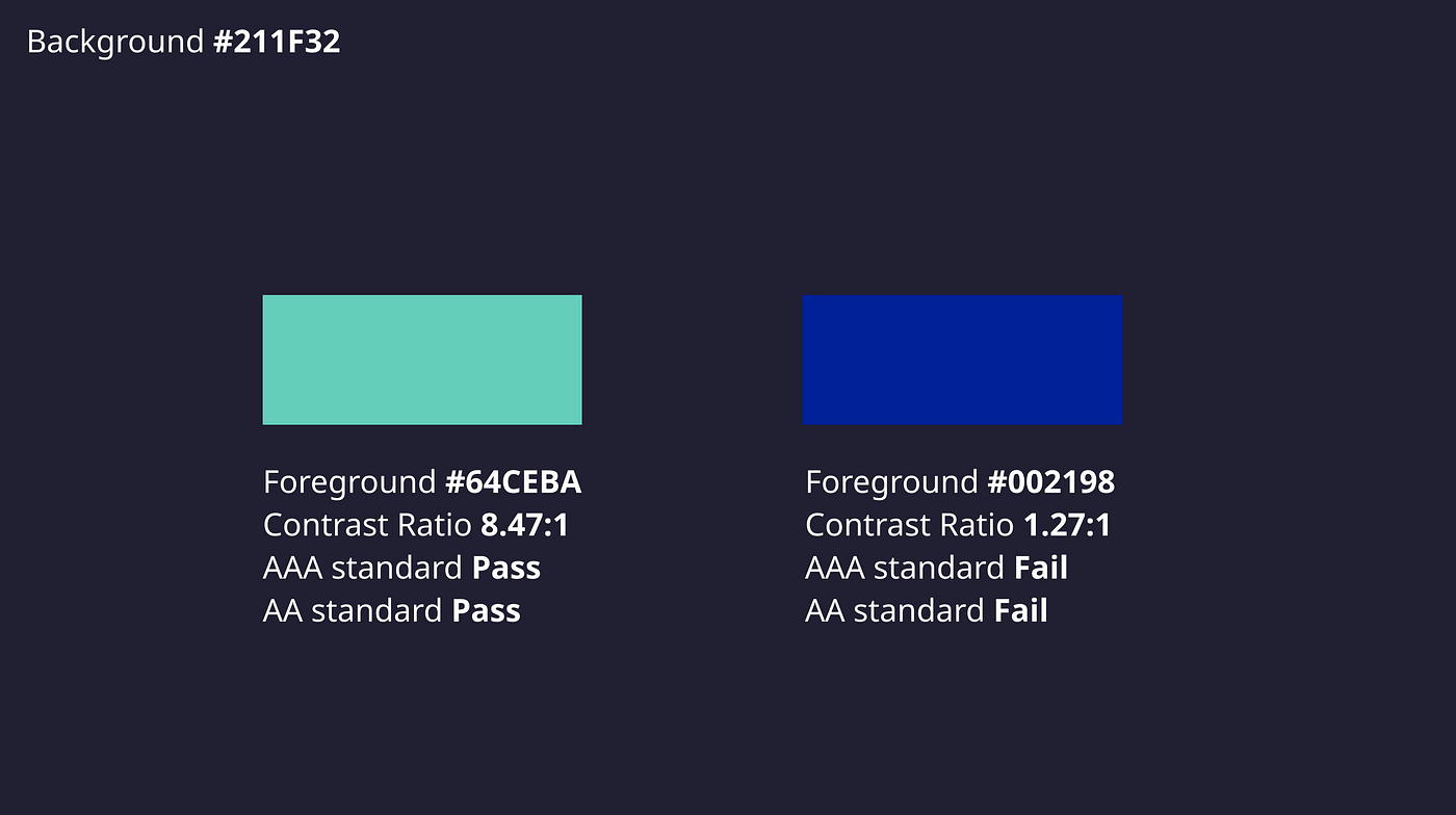
Here are two palettes I used for testing:
https://codepen.io/puhe/pen/BaprEjo
https://codepen.io/puhe/pen/oNBqOxm
Contrast ratio checker:
https://webaim.org/resources/contrastchecker/#:~:text=WCAG%20Level%20AAA%20requires%20a,(typically%2024px)%20or%20larger.